


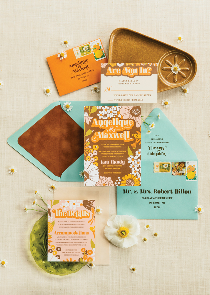
Groovy Kinda Suite | Designed by Invitations by Caitlin
“I love creating colorful, bold designs, so I was very excited to put a modern and fun spin on a retro-inspired suite,” says designer Caitlin Sedliar. “I mixed in some texture to nod to the ’70s, lining the outer envelope and backing the invitation with velvet paper. Metallic envelopes added to the playfulness of the suite, with the cool turquoise envelope balancing out the warm hues of the paper goods. I really wanted to show that your wedding invitations should truly be a reflection of your personality, even if that’s not necessarily what’s traditional or trendy.”

Autumnal Garden Party | Designed by Erin Braun | Engraving by Focus & Light
“With this garden party inspired invitation suite, I wanted to represent the transition between summer and fall in Michigan in an artistic and sophisticated way,” Erin Braun says. “I drew inspiration from bountiful and textural gardens filled with dahlias, along with rust tones found in fall foliage and wood burning fires. Layers of texture were built through blind deboss and letterpress on white cotton paper, laser engraving on Michigan cherry wood, and hand cut paper appliques.”

Artful Architecture | Designed by The Ambrosia Rabbit
“This suite was inspired by the Guardian Building’s art deco design and its iconic geometrical architecture and bold colors,” says Tiffany Harold of The Ambrosia Rabbit. “The show-stopping envelopes were custom cut to reflect the silhouette of the Monel metalwork screen in the lobby, and the enclosure cards were designed with a gold foiled arched trim to reflect the semi-circular domes found in the Banking Hall and over the main entrance. The invitation itself is mounted on an emerald cut green backing, inspired by the octagon mosaic shapes found in the ceiling, and it has subtle blind embossed lines running along the edging. Each piece in this suite contains elements that were double or triple mounted to create a layered effect to create the same enfilade visual impact that you get when you enter the Guardian Building and see the lining up of architectural elements and spaces for one complex and rich vista.”

Modern Color Block | Designed by LePenn Designs
“Using the venue, The Detroit Institute of Arts, as the inspiration, I incorporated a modern art-inspired pattern into the suite along with an array of bold and colorful papers,” Le’Trice Penn says. “The main invitation is triplexed with three different paper colors and features the pattern as a blind debossed background along with white foil stamping on top of it. A blind debossed monogram is also featured on the backside of the invitation as an unexpected but fun detail. More pattern play is shown in printed form on the insert card and envelope liner, and the inspiration from the modern pattern is continued with the custom die-cut shape of the second insert card.”

Regency Reimagined | Designed by Leah E. Moss Designs
“Using the romantic, soft lines reminiscent of Regency-era England, as we’ve all come to love from watching Bridgerton, I kept this invitation delicate and ornate,” Leah E. Moss says. “The motif on the main invitation card pairs beautifully with the repeat pattern in the envelope liner tucked softly into a translucent wrap tied with a silk ribbon. Traditional calligraphy was used for the invitation design and envelope addressing. This classically sophisticated design is timeless but brings in a 21st-century color palette with dusty rose and terracotta, paired with cream and blush. This suite, along with a series of others, makes its debut as part of my collection this summer. Personalize your own with colors, print methods, and bells and whistles, to make your dream combination.”


